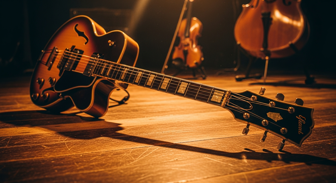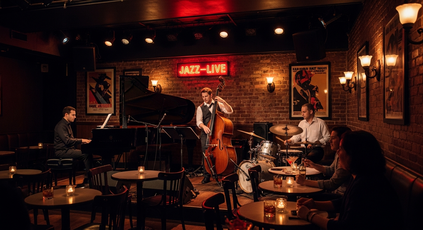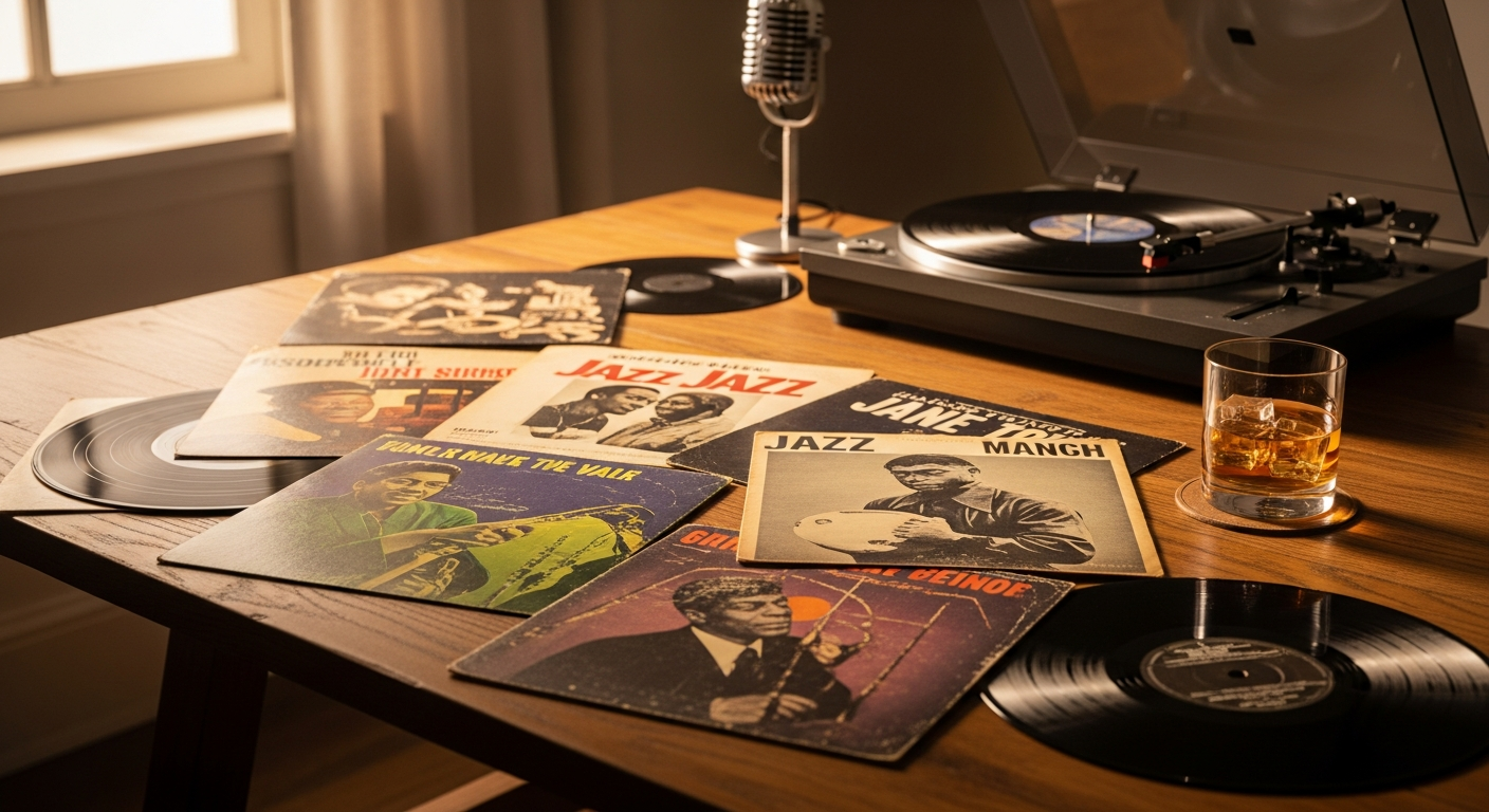
Before you hear a note, you see the cover. Jazz album art — at its best — does more than package music. It establishes mood, communicates artistic intent, and creates a visual identity that becomes inseparable from the sound within.
Why Are Blue Note Album Covers So Famous?
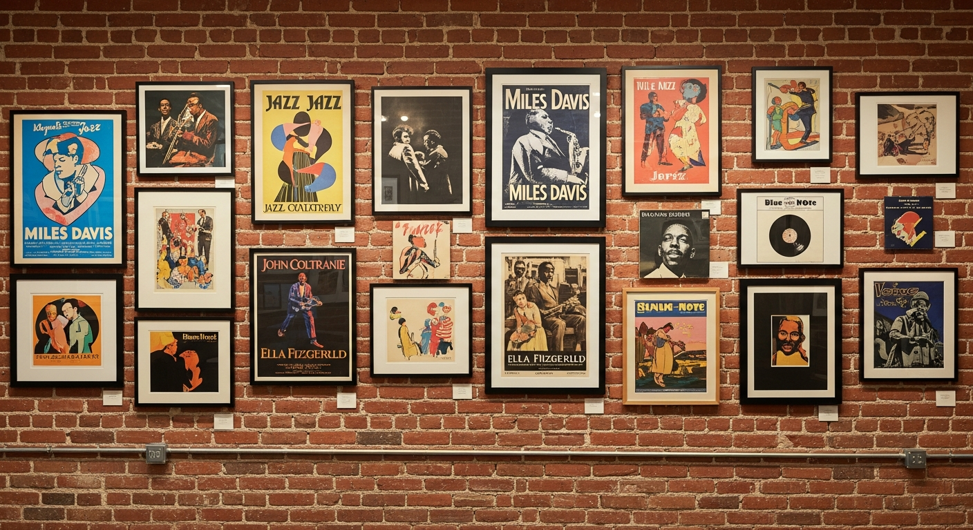
The pinnacle of jazz visual design remains the Blue Note Records catalogue of the late 1950s and 1960s. Reid Miles, the label's primary designer, created over 500 covers that collectively defined how jazz looks. Working with photographer Francis Wolff's remarkable candid images — musicians captured in the intensity of recording sessions, wreathed in cigarette smoke, eyes closed in concentration — Miles developed a visual vocabulary that was sophisticated, modern, and unmistakably jazz.
The hallmarks of his style are deceptively simple: bold sans-serif typography, often split across the cover in unexpected ways; dramatic use of negative space; colour reduced to its most impactful elements. The covers communicated an essential truth about the music — that it was modern, sophisticated, and worthy of serious attention.
How Has Jazz Album Art Evolved?
Each subsequent era of jazz developed its own visual language. The fusion era of the 1970s brought psychedelic imagery and painterly abstraction. ECM Records created a distinctly European aesthetic — minimalist, often featuring landscape photography that suggested the spacious, contemplative quality of the music within. Japanese jazz labels developed their own distinctive approach, often more playful and graphically adventurous than their Western counterparts.
The digital era presented an existential challenge. As music consumption moved from physical to digital, the album cover shrank from a twelve-inch canvas to a thumbnail. Many predicted that album art would become irrelevant.
What Is the Future of Jazz Album Art?
Instead, the vinyl revival has renewed interest in cover art as a physical medium. Contemporary jazz labels are commissioning original artwork at rates unseen since the 1960s. Illustrators, painters, and photographers are finding a vibrant market for their work in jazz packaging.
A great jazz album cover is an invitation. It says: what you are about to hear is worth your full attention. In an age of infinite distraction, that invitation has never been more valuable.